This week four friends and I found our house for next year! I am so so excited that we finally got through the stress of finding a house! We found a 2 year old 5 bedroom house with huge double porches that look so perfect and homey. I wish I had a picture to add but I don't yet! I've already started thinking about how I want to decorate my space and I can already tell I've learned a lot from my classes this year. I really want to find a bunch of vintage mirrors of different size and make a "collage" of them on a wall. I've seen that done before in a friend's guest bathroom and it gave a really nice classic vibe. I picture gold, intricate framed mirrors of all different sizes on a small wall maybe over a desk.
This picture is similar to what I'm picturing, but I don't really like the white frames. I'd rather it all just be gold because I like the vintage, classic feel.
My future bedroom isn't very big so I'm definitely going to have to find some good storage ideas! I really want to find some antiques or maybe even make some furniture out of scrap wood. I've seen it done on pinterest so if they can do it so can I!
I'm so excited to after two years of sharing a tiny room to finally have my own space again!! I can't wait to move in in the fall and get to decorating!!
Monday, October 15, 2012
Thursday, October 4, 2012
Today's find
On Pinterest today I stumbled across this Tumblr page called Redefined Style! It is simple but has a great collection of pictures of clothes, shoes, jewelry....anything fashion. I really enjoy the variety of the styles shown on the site. Enjoy!!
http://refinedstyle.tumblr.com/
Tuesday, October 2, 2012
FALL
I love fall!!! Not only is the weather a huge relief from the Georgia heat....but with the cooler temps comes fall fashion! I look forward the fall clothing all year long. The chunky scarves, boots, and furs are so beautiful and fun to layer and wear! Pinterest has really fostered my love of fall clothing and I found these great pictures showing some of my favorite looks.
I love layering because of how you can wear a certain dress or shirt with different sweaters or vests and make it look totally different. Here, I like how she mixed the small pattern of the flowy dress with the texture of the short fur vest. Putting a dress with a warm vest is a good transition outfit since it won't make you too hot since the temperature can still feel a little warm.
The thick, off the shoulder sweater adds a laid back, casual vibe, but the black tights make the outfit look more dressy. I love the chunky knit of the sweater mixed with the slick oversized leather bag. Big handbags are my personal favorite and I love carrying them because you can just throw everything in for the day! I also think her hair is great.
Tuesday, September 11, 2012
Variety
These images are several that I found interesting. I loved the high ceilings of the apartment in the bottom right and I enjoy the symmetry of my dining room in the top right. I like it when a space is put together but still inviting, and these photos all exhibit that.
Unity and Harmony
Unity and harmony is created in these interiors because of the objects that have been grouped together. To me, unity and harmony is when a space is inviting and comfortable but still well put together, and I think these spaces achieve that.
Scale and Proportion
The scale and proportion in these settings is acheived by having similar size (or in several cases identical) objects grouped together to create either a proportional environment or one which has different sized objects like the top middle and top right photos. In these images, the heights and widths of the objects differ and create a more casual feel than the images where all the objects are the same size. (It's hard to tell but in the top right photo, there is a large owl painting, a frame on the bottom left, and a vase on the bottom right)
Movement
Movement is created when a space causes the eye to move from one area to another, and I think these areas achieve that. Movement creates a comfortable, inviting space that seems like it would be pleasant to spend time in. The composite photos in the second picture take the eye up the stairs, while my living room in the bottom left picture, causes the eye to go from the fireplace, to the sofa, and around the room.
Repetition and Rhythm
The repetition of patterns and shapes is an obvious use of repetition that brings the space together. Rhythm is achieved by the "flowing" nature of the spaces, such as the two large windows creating an upward rhythm making the room seem very tall. Or, in the first photograph, the sconce, mirror, sconce combination takes the eye down this hallway.
Emphasis
Emphasis in these interiors is established by the arrangement of objects on the cabinets and in the first photo, emphasis is created by the sconces on the wall putting emphasis on the picture. The height of the lamp draws attention upward, but the colors and objects draw attention back to the surface.
Balance
Symmetrical
Radial
The above frame arrangements all demonstrate symmetrical balance, both vertical and horizontal. The arrangements are very classic and create a comfortable but still somewhat formal feel.
Radial
These images all represent radial symmetry because they are all symmetric in a circle around a point. My favorite is the paper chandelier, with all the small pieces individual showing radial symmetry, as well as the chandelier as a whole.
Thursday, September 6, 2012
Texture
Actual Texture: My Room
All of these pictures came from objects in my room. I like the depth of the textures of these objects, especially the richness of the bowl in the second picture.
All of these objects seems as if they have texture, but it really is just the decoration and color variation which creates the appearance of a tactile texture.
Wednesday, September 5, 2012
Space
Actual Space: Things I Love
Implied Space: Miscellaneous Scenes
These photos show two of the things I love most; my dog and Venice. My dogs bed shows actual space because she is able to inhabit it and it has a defined area. The picture I took of this canal in Venice represents the same concept.
Implied Space: Miscellaneous Scenes
I think that these pictures all represent implied space because you can tell that there is an area that is meant for movement or for something (such as stone where the Colosseum is missing some) to be, but each lacks an actual defined space. The ski slope for example, you can tell that you are meant to go between the trees, but there is no defined wall or boundary that you cannot cross (since you could just go through the trees) blocking your movement.
Monday, September 3, 2012
Non-Objective Forms
I took a picture of my desk in Chemistry class because I thought it represented a non-objective shape. It is also geometric to me but I think it is non-objective because it is a strange shape that I have never seen besides in this desk and it clearly does not represent anything. I bought the coaster on the right at Anthropologie and I love it because of the strange design that was created by hand to be one of a kind. It is a beautiful shape that is non-objective because again, it does not clearly represent anything other than possibly an inner picture created by the artist.
Abstract Forms
The above photos all represent abstract form but for different reasons. The owl rug on the far left is abstract because the owl is portrayed in a whimsical way unlike how a real owl would appear in the wild. The second photo of the sculpture of a dog in robes is abstract because it shows something that would not be seen in real life. I love the abstract shape and lines of the mushroom I found in a horse pasture at my family's farm this weekend. I like how it curves upward almost like it has been opening. Mushrooms are fascinating to me and I think that this one is the most interesting I have ever seen. The corkscrew on the right is another abstract shape. The spiral is appealing to me but I still think it is abstract because you do not see such a spiral very often created naturally.
Images of Plane
The above photographs all illustrate the usage of plane. Whether they are translucent or opaque, they still embody the ideas behind a plane. My favorite is the stained glass at St. Chapelle in Paris because of the bright colors and intricate designs that make up the plane. The other examples are not as exciting, but still exhibit the same qualites of a plane, such as forming a flat shape and having shallow depth.
Dynamic Form
I took pictures of these paintings in Europe. "School of Athens" on the left shows dynamic form through the apparent movement of the people in the painting. The way in which they are painted make it seem as if they are really walking, talking, and gesturing. The Matisse painting on the right at first seems like it would be static, but I think that the altered shapes make it seem dynamic because of the qualities of movement.
Static Form
The symmetrical qualities of these stone forms (the partial column on the right I took in a parking lot and the Sphinx photograph I took at the Louvre) reminded me of static form because the left and right of each object are mirror images of each other.
Natural Form
The movement in these statues (which I photographed in Europe) embodies the definition of natural form. Even though the statues are made of stone and clearly not actually moving, the way in which the sculptor formed the stone makes it seem as if the statue is as real and you and me and could start moving any second.
Geometric Forms
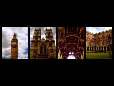
I took these photos in London and I thought that the stone shapes used in the structures reflect the ideas of a geometric form. I think the geometric shapes of the structures make them seem strong and powerful.
Thursday, August 30, 2012
Implied Lines
When I saw these rods running horizontally to the ground, I immediately associated them with an implied shape of a rectangle that would continue to the ground. I also liked the exposed look of the beams.
This broken concrete block implies that the rectangular shape would continue in a straight line where pieces broken off because of its geometric shape.
Wednesday, August 29, 2012
Non-Representational Shapes
I like the non-representational shapes used in these fabrics because of the fun, whimsical feel they create.
I made this over the summer and I really love the shapes and lines the melted crayons formed because I think that non-representational shapes allow each person to interpret them differently, creating a piece that can appeal to many different people and elicit unlimited responses.
This photo of a T-shirt design definitely has a more edgy feel and the non-representational shapes and lines within the skull produce a strange affect and make the viewer wonder what the artist is trying to portray.
Abstract Shapes
These pictures are from my planner and I chose them because I like the fun feel created by the abstract shapes as well as the use of bright colors mixed with white space to create these fun yet artist drawings.
I found these patterns on some album covers my friends had and I chose these two because the bands created these designs to represent themselves and their music in a way that others may not immediately respond. I like how abstract shapes can be used uniquely to promote an underlying message or belief, which is what I think is happening on the album covers.
Natural Shapes
When I think of natural shapes I think of nature, so in this collage I tried to use photos of just that, nature, and coral is my favorite pattern as well so I had to include it! I like the soft shapes of the leaves because the are inviting and have a calming affect on me which I think is caused by their natural shape.
Geometric Shapes
I like geometric shapes and I like the diversity in this collage and the brick picture is my favorite because the gaps create a shocking contrast.
Structural Lines
The structural lines utilized here create a feel of power and strength that are perfect for these towering monuments and structures.
Diagonal Lines
In these photos I took in Europe, the diagonal lines and angles add to and enhance the architectural value and affect of these structures.
Vertical Lines
Clothing is my passion and I love how the angles and effects really enhances the visual appeal of the vertical lines.
This next picture (which is untouched) I took while at Kinkos when I looked into a trash can because I saw beautiful, bright colors created an incredible photo which shows shockingly vivid vertical lines.
Horizontal Lines
I liked the collection of these photos all showing horizontal lines because they all incorporate different materials and textures, but still all maintain the usage of horizontal lines. And I have to brag...I made the pot in to top middle photo!
Points
Points of Paris!
Random points when I (sadly) can't be in Paris!
Much more boring than the Paris pictures I know, but my ordinary life in Athens is very boring!! I thought the match was interesting because it was split down the middle! And I found the points of the
fence very attractive.
A somewhat more exciting picture from Switzerland!
I also took this over the summer when I spent a few days in Switzerland. This mountain has several points and it is very beautiful.
Thursday, August 23, 2012
Trout, Unexpected Beauty
This is a picture of a trout that I bought at Earth Fare this week to have for dinner. A lot of people look at a dead fish and see a slimy, gross creature. But when I look at this picture, I see beauty. The scales shine in the light and show a range of colors. The fish's eyes to most would be disgusting, but I think the light that reflects off of them is beautiful. To me, its skin is what makes it beautiful. Its smoothness and shininess are attractive and have a feel unlike anything else. I think that this fish shows unexpected beauty because you don't think you will find beauty in something that is slimy and dead, but if you really look at something and admire its qualities, beauty can be found almost anywhere.
Beautiful
I took this picture while I was in Venice this summer. I loved the color of the stone walls with the bright colors of the flowers. I thought the worn look of the walls and the lively flowers created a beautiful scene. The flowers looked so bright next to the dull wall that it was almost shocking that it was real. I also thought the small white balconies were beautiful against the tan walls because of the delicate, intricate shapes of the balcony. They look regal covered in the beautiful, colorful flowers and next to the tan walls. The cloudless blue sky also adds a surreal quality to the scene. I like the mixture of old and new with the old walls and the lively flowers. This contrast is beautiful to me because I like mixing old and new objects. I think that this picture would be considered beautiful to most people because of the bright colors of the flowers and the regal white balconies mixed with the dull, historical tan walls.
My designers
I chose the designers posted on the right because they embody a wide range of styles, all that I find attractive and appealing. The fabric design company, Manuel Canovas, was one that I discovered while interning with an interior designer this summer, and I love the patterns of his fabric. Some of these designers represent the classic style that I am normally drawn to, but others have more opulent or modern styles that I also appreciate. Two of the posted designers are located in Athens, which surprised me because I wasn't aware there were so many designers here that I could possibly try to get a job with this semester! Overall, I enjoy looking at the diverse work of my posted designers because it gives me new ideas and broadens my range of knowledge.
Tuesday, August 21, 2012
*Links*
I chose my links based on my likes and things that interest and inspire me. They range from clothing to cooking to skin care products. The links encompass my taste and style, and also feed my shopping addiction. I spend hours online looking at clothing, jewelry, and ideas for decorating, and these websites are some of my favorites mixed in with more recent finds.
Thursday, August 16, 2012
My Style
My style is a blend of classic design with more modern patterns and colors. I like mixing antiques with bright colors to create a more exciting look. In my opinion, a successful room is one that is well put together and great for entertaining, but still comfortable and fitting to one's style. I like using vintage style pieces like old frames and recycled wood for tables. I think that by mixing pieces like this with nicer items creates a comfortable and fashionable vibe. Artwork can also really bring a room together and makes walls more exciting. I love old brick houses and white houses because of their old Southern charm as well. Overall, I would describe my style as classic but with newer influences.
In this room I like how they used the fun cow hide rug to add a fun twist to a more
formal looking room. I like how they kept the color scheme consistent as well.
I love the glass front cabinets in this kitchen. They really help to keep the room open, important
since it is such a small space. The classic runner elongates the room and creates a comfortable but classic feel.
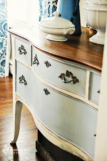
The stain on the drawers of this cabinet make it look vintage and one of a kind. I like the mixture of finishes like the antique top but painted and distressed front. I also like the old fashioned drawer pulls.
I love the subdued shades of blue and yellow in this room. It really creates a calm, classic environment that would be great for entertaining but also just for lounging around at home. I like the pattern of the chair and how it is maintained in a pillow on the sofa. The pops of green in the paintings add brightness and the pillows make the room seem comfortable and inviting.
This kitchen island reminds me of the cabinet posted above because of its distressed finish and vintage feel. I like how overall the kitchen is somewhat formal and well put together, but the finish on the island adds a more casual aspect as well as color. I like the subdued colors they used because it creates a calm feeling but also makes the space look classy and charming.
I love the comfortable but still stylish look of this dress. I'm really in to the off the shoulder look recently and I think the color and material of this dress is very flattering.
Lace is one of my favorite fabrics, especially when it comes to clothes. I like how with this dress, the designer used the lacy for a more revealing look, but still kept the look classy.
I love to bake in my spare time or when I'm home from school and Red Velvet is my favorite! I'm looking forward to trying this Red Velvet Cheesecake recipe.
Wednesday, August 15, 2012
What is interior design?
To me, interior design isn't about being trendy or doing what's popular, but more about creating a space that reflects one's own personality. It's mixing different styles to form a unique room that blends old, new, bright, and subdued. I think that anyone can be an interior designer, with or without training, because decorating a space isn't about what you've been taught, but about what feels right to the individual.
I like how two different patterns were used on this chair but the same color was maintained. It's
unexpected and adds a fun, casual vibe.
Toile can sometimes look boring, but the bright colors used here really make the pattern pop
and create a new twist on a classic pattern.
Turquoise is one of my favorite colors and I love how here it is paired with the grey chair,
window treatments, and wall color to really tie the room together and add a pop of color
to an otherwise subdued room.
I like the shabby chic feel of this room and the mixing of different patterns and textures
of the all white bedding. All white bedding is a classic and mixing patterns and textures creates a more casual, inviting feel.
Subscribe to:
Posts (Atom)